Keine Kommentare
Firmenname, Logo und CorpDesign Immobilienunternehmen
- Wettbewerb von: c.probszt@remax-solutions.at
- Kategorie: Logo & Corporate design
- Status: Beendet
- Dateien: Datei 1
Startdatum: 09-08-2016
Enddatum: 26-08-2016
Alles begann mit einer Idee …
Ein kurzer, interaktiver Leitfaden half ihnen, ihren Designstil zu entdecken und erfasste genau, was sie brauchten.
Brandsupply ist eine Plattform, auf der kreative Fachleute und Unternehmen gemeinsam an einzigartigen Projekten und Designs arbeiten.
Kunden, die zum Beispiel ein neues Logo oder eine Markenidentität suchen, beschreiben ihre Anforderungen. Designer können anschließend über Brandsupply am Projekt teilnehmen, indem sie ein oder mehrere Designs einreichen. Am Ende wählt der Kunde das Design aus, das ihm am besten gefällt.
Die Kosten variieren je nach Projekttyp – von 169 € für einen Firmen- oder Projektnamen bis zu 539 € für eine vollständige Website. Der Kunde entscheidet selbst, wie viel er für das gesamte Projekt bezahlen möchte.
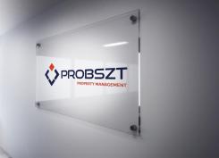
It will be perfect for plexiglass ads.
Here is the example.
Thank you
great
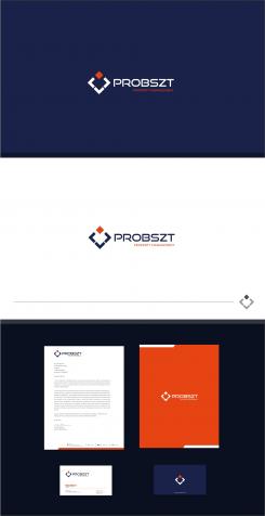
Stationery design
What is that?
Hello there, I'm sure you will be doing well with the contest here.
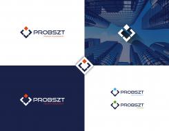
Worked on a very upscale and clean concept, which clearly encompasses the service you offer in a very simple and responsive way.
Would love to hear any thoughts you might have on it.
Kind Regards,
The logo represents the services(sub departments) which you offer from your management. The main orange square represents the different services you offer and the blue objects shows in all ways you can handle those solutions in a responsive way. The overall logo looks like a upscale ad clean concept for your firm.
Thank you
Bottom blue objects = Management
Top square = services and sub departments
i like the colours and the design at all. i am just afraid that the contrast is not that advantageous. one of the ads should be directly on houses which are under our administration (administrated by...) in a format A5 or A4 landscape on plexiglass so would it have a clear recognition and readability?
Concept 1
Looks very good. Very similar to another designers work but with something special
Dear Bewoulf,
Is not ok stole the whole concept and idea for me, all your story for the logo is actually mine. your just rotate and cube put up. Your new designer here and that is not right to steal someone else's idea.
greeting,
Milla
Hello factor, my design is completely original and i don't want to steal or copy from other designers ok. Don't under estimate some one's creativity. The explanations are based on the company profile with my final art work. You need to learn more basics, i am new here but i am not a new designer i have 6+ years of experience in this field.
FYI see this link to find out when this artwork is designed.
http://www.designcrowd.com/design/4230110
http://designers.designcrowd.com/designer.aspx?designerId=21188&freelance;-design-page=3
Rgds
kartik
Dear B,
In this contest not mentioned anywhere cube design. i work on that and crate P letter with part of solution. with other departments with different color. you look my design and use all that for your design with my idea, and story that is fact.
Hello, first of all think well square is the common element we can use any where in the contests. If client like square or circles or rectangles in previous designs we can use those elements in your own concepts but it shouldn't be same as others design. In this case both designs are different but we both used common square element ok. Got it?
And also from the start you are saying you used cube elements my concept is square. There is no P in my concept too. I explained from my design not from yours .
My design is entirely different concept.
Three bottom elements represents like a management/company that holding the services they provide Like Asset management, property management etc. Its more than your concept. cube,P or something etc...
 Nederland
 België
 France
 Deutschland
 United Kingdom
 International
