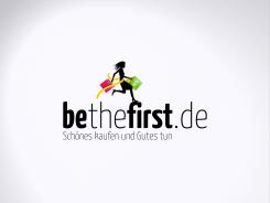
hi Vera,
I've now made the subtext as big as the title. Is this better?
Henry
Logo für Accessoire/Schmuckshop mit Chartity Gedanken
- Wettbewerb von: VeraRiehle
- Kategorie: Logo
- Status: Beendet
- Dateien: Datei 1
Startdatum: 18-11-2012
Enddatum: 14-12-2012
Alles begann mit einer Idee …
Ein kurzer, interaktiver Leitfaden half ihnen, ihren Designstil zu entdecken und erfasste genau, was sie brauchten.
Brandsupply ist eine Plattform, auf der kreative Fachleute und Unternehmen gemeinsam an einzigartigen Projekten und Designs arbeiten.
Kunden, die zum Beispiel ein neues Logo oder eine Markenidentität suchen, beschreiben ihre Anforderungen. Designer können anschließend über Brandsupply am Projekt teilnehmen, indem sie ein oder mehrere Designs einreichen. Am Ende wählt der Kunde das Design aus, das ihm am besten gefällt.
Die Kosten variieren je nach Projekttyp – von 169 € für einen Firmen- oder Projektnamen bis zu 539 € für eine vollständige Website. Der Kunde entscheidet selbst, wie viel er für das gesamte Projekt bezahlen möchte.
perfect. I am really happy. Have a nice weekend!
Thanks :)
Nice weekend!
Henry
Hi Vera,
You mean like this?
Henry
yes just bigger (subtitle) like in your other drafts! the pink in my homepage is a little darker pink, more reddish than purple do you have that? Is the font color the same as the bag? Vera
Well, it is even bigger than the other. If you look at where the text ends. I did copy the color from your site and the subtext color is the same as the bag.
If you click on the image, you'll see a better version.
Henry
yes, but it won't be possible to read because if you look at my homepage you see the size that is for the logo.
Hi,
I've made the text in Arial and the subtext in Benguian. The other fonts were not so useful in my oppinion.
Hope you mean it like this.
Henry
Hi Henry, yes you are right these are the best fonts. But the subtitle has to be as big as in the other drafts otherwise it is hard to read. Thanks! Vera
How would the subtitle look in pink?
Hi Vera.
I've made the changes.
Henry
Hi Henry, the logo is nice and perfect. I was just thinking about the different fonts in the logo and in my homepage. I have the fonts of my homepage, I could send it to you?
Hi Vera,
Thanks. I will change the font, if you can email it to me.
Henry
Hi Vera,
I think you mean it like this.
Henry
yes. I will think about it for a few days and will let you know the final design :) thanks
Thanks :) I will wait for your answer.
Henry
Hi Henry. I decided for a shop theme now. Please go to my page (www.bethefirst.de) there you see the colour of the fonts, can you use the same colours in the draft?
And please remove the "20%" on the bag. Also no bold letters.
Thanks a lot!!
Vera
Hi Vera,
I had the subtitle centered under the woman. Now i've centered it under bethefirst. I've removed the ribbon.
Hope you like it
Henry
Hey Henry, yes it looks much better without the ribbon, good job. this is 95% :-)
2 little things about the font: maybe we can try to make the "be" and the "first" only a little bold, not so much as in the first draft. And I prefer the subtitle to be to the left side.
Thank you for making all these changes!
Vera
Hi Vera,
I've made the changes.
Hope you mean it like this.
Henry
Hi Henry, yeah looks good! but is the titel under bethefirst.de centered? doesn't look like it. And just to see can you remove the band/ribbon?
thanks!
Here is the black version.
If it is not good enough, I can add a white outline.
Henry
 Nederland
 België
 France
 Deutschland
 United Kingdom
 International
