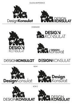
Hi, here's a selection of open source font (from website fontlibrary.org)and some homemade variations. Regards,
Hersteller hochwertiger Designermöbel benötigt ein Logo
- Wettbewerb von: designkonsulat.de
- Kategorie: Logo
- Status: Beendet
- Dateien: Datei 1, Datei 2, Datei 3
Startdatum: 02-10-2017
Enddatum: 16-10-2017
Alles begann mit einer Idee …
Ein kurzer, interaktiver Leitfaden half ihnen, ihren Designstil zu entdecken und erfasste genau, was sie brauchten.
Brandsupply ist eine Plattform, auf der kreative Fachleute und Unternehmen gemeinsam an einzigartigen Projekten und Designs arbeiten.
Kunden, die zum Beispiel ein neues Logo oder eine Markenidentität suchen, beschreiben ihre Anforderungen. Designer können anschließend über Brandsupply am Projekt teilnehmen, indem sie ein oder mehrere Designs einreichen. Am Ende wählt der Kunde das Design aus, das ihm am besten gefällt.
Die Kosten variieren je nach Projekttyp – von 169 € für einen Firmen- oder Projektnamen bis zu 539 € für eine vollständige Website. Der Kunde entscheidet selbst, wie viel er für das gesamte Projekt bezahlen möchte.
Hi, the homemade font on the left top looks really cool! The arrangement on the left top with the lettering underneath the logo is also great - lets continue with this variant!
Could you please provide us a version where the "D" and "K" are larger than the remaining parts of the words? [still only capital letters but a difference between the font sizes]
In case you also have smnall letters for this font it would be great to see how it looks if the "D" and "K" stay capital letters and all remaining letters get small or even a version with solely small letters.
Thanks for your great work!
Regards
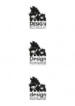
Hi, here are the typographic variations. I personnaly prefer the third one with small letters. Have a nice day,
Hi, thanks for the variants of the font! We prefer the font with solely capital letters and all letters in the same size like in the version before. Lets go with this variant!
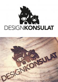
Hi, here is the reunited wild boar family with the piglet haircut. If you have preferences or suggestions about typography, do not hesitate to let me know. Regards,
Hi, now the logo looks really great -thanks for that- thus we can, as you already suggested, continue by optimizing the font. First things first - it is important that the font we use is open source that we are allowed to use it in our logo without harming any IP rights.
The general style of the font you chooe is already pretty much what we are looking for. Maybe you can provide us some different options of fonts to choose from. The font should have a clear and plain look, but of course it can have a distinctive feature like a unconventionell written letter or anything like that.
We thought also about using capital letters for D and K while using small letter for the rest of the word. Another option we discussed was how it may look if the whole writing is on the right side of the boars.
Looking forward to your suggestions!
Regards
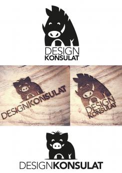
Hi, here are the two separated boars. I also rounded the horns of the adult boar in order to make it more friendly. Regards,
Hi, thanks for separating the boars. After discussing all different designs we think that the version of the two boars together fits our products and image best. Because of this we want to go with the two boars togehter.
What we like about your latest design is the revision of the kid boar with the hair that gives it the finishing touches.
Can you please revise the design once again by bringing the boars togesther again while taking the "new" kid boar with the hair? Thanks for your efforts!
Regards
Hello, here is a version of the logo with a boar piglet and a boar with a milder look. Regards,
Hi, thanks for processing our wishes that fast! Now the boar looks a lot friendlier and expresses much better our connection to kids products. That is really good!!!
Seeing both boars next to each other we though about how it may look if we would only have a single one of them. Maybe it gets a bit to large for a logo that gets branded into the wood have both in the logo!?
Could you please separate the two boars and show us how they look when we only have one of them (small or large)?
We are not quite sure if the large or small one fits our image better, so we would be thankful if you could provide us both possibiklities to decide which one is better.
We think that we are on a very good way with the boars and are already looking forward to your revised design!
Hi, here's a proud but harmless boar, not too detailed, so that it can be easily engraved .Regards,
Hi, thanks for your design! We already really like your suggestion but we would like to have another countenance of the boar. Maybe it should look more friendly and kind like the one you proposed.
Another idea of us is if the boar could have a small one next to it or something like this to emphasize also our collection for kids.
Thanks for your efforts!
 Nederland
 België
 France
 Deutschland
 United Kingdom
 International
