Keine Kommentare
Firmenname, Logo und CorpDesign Immobilienunternehmen
- Wettbewerb von: c.probszt@remax-solutions.at
- Kategorie: Logo & Corporate design
- Status: Beendet
- Dateien: Datei 1
Startdatum: 09-08-2016
Enddatum: 26-08-2016
Alles begann mit einer Idee …
Ein kurzer, interaktiver Leitfaden half ihnen, ihren Designstil zu entdecken und erfasste genau, was sie brauchten.
Brandsupply ist eine Plattform, auf der kreative Fachleute und Unternehmen gemeinsam an einzigartigen Projekten und Designs arbeiten.
Kunden, die zum Beispiel ein neues Logo oder eine Markenidentität suchen, beschreiben ihre Anforderungen. Designer können anschließend über Brandsupply am Projekt teilnehmen, indem sie ein oder mehrere Designs einreichen. Am Ende wählt der Kunde das Design aus, das ihm am besten gefällt.
Die Kosten variieren je nach Projekttyp – von 169 € für einen Firmen- oder Projektnamen bis zu 539 € für eine vollständige Website. Der Kunde entscheidet selbst, wie viel er für das gesamte Projekt bezahlen möchte.
Keine Kommentare
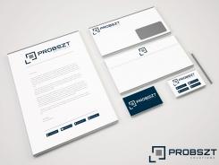
this is a bit too dominant. I do not take myself so serious that I need my name that big on the head of a letter;-) The small symbols in the footer I love very much
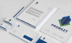
Dear Probszt, I committed changes now is smaller symbols with company name. Do you like, like this? Or you want to be smaller ? Greeting,
Milla Lekic
Hello factor, my design is completely original and i don't want to steal or copy from other designers ok. Don't under estimate some one's creativity. The explanations are based on the company profile with my final art work. You need to learn more basics, i am new here but i am not a new designer i have 6+ years of experience in this field.
FYI see this link to find out when this artwork is designed.
http://www.designcrowd.com/design/4230110
http://designers.designcrowd.com/designer.aspx?designerId=21188&freelance;-design-page=3
Rgds
kartik
Dear B,
In this contest not mentioned anywhere cube design. i work on that and crate P letter with part of solution. with other departments with different color. you look my design and use all that for your design with my idea, and story that is fact.
Keine Kommentare
perfect
Dear Probszt, Thank you for your comment. We can do for each departments business cards,envelope,folder, letter. Can be the same as this only in different colors to represents different departments.
Greeting,
Milla Lekic
Keine Kommentare
this looks perfect
Keine Kommentare
Dear,
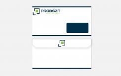
Hope you have something like this on mind for stationary, if you have any suggestion fell free to write, i will soon send stationary for other departments.
Greeting,
Milla Lekic
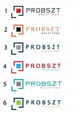
also i will send you stationary color combination 6 to view.
thats also nice, just the business card with the 4 bars are too much. but you anyway solved it better in the new version
Keine Kommentare
Dear,
Do you like some of this fonts, combination color?
Do you have some suggestion of color, font. you can have your premium color example 1, royal blue for probszt and for other departments can cahne color of cube and color of department. If you have any suggestion fell free to write.
Greeting,
Milla Lekic
I like the color combination 3 and 6. The font style I think was best in the first drafts
Keine Kommentare
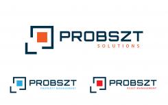
main title for departments to be Probszt solutions, domain is free for probsztsolutions.com, .at, and .eu.
The other two departments property management and asset management under main department Probszt solutions. And if you expand the job is easy to add new department. if you have any suggestion fell free to write.
What can you do (e.g. changing colours, font stlye,...) to make the look more professional. Especially "Asset Management" should be adressed to HNWI, banks, investment funds, tax adivisories,...
Did you use license-free fonts?
Keine Kommentare
When I created the logo I was thinking about different departments the square represents the letter p but different color in square represents different departments the corner is also arrow which represents solutions.
Keine Kommentare
pro-bszt I do not like too much. My name is PROBSZT not Pro-bszt. What about were you thinking when creating the square with the corner. I also like that you use different colours for different departments. How would you combine the departments "brokerage" where I have to workk with the franchise "RE/MAX" as well?
BTW I am located in Austria. so .at is better than .de or something more neutral like .com
 Nederland
 België
 France
 Deutschland
 United Kingdom
 International
