Hi Joe,
I did everything to hide the "p" and/or "q", as well as the connection to the "beats" logo. Hope it solved the Problem.
Thank you again for your feedback!
-Sascha
Design a new logo & CI for “Dukes of Data GmbH
- Wettbewerb von: DoD´s
- Kategorie: Logo & Corporate design
- Status: Beendet
Startdatum: 30-07-2018
Enddatum: 15-08-2018
Alles begann mit einer Idee …
Ein kurzer, interaktiver Leitfaden half ihnen, ihren Designstil zu entdecken und erfasste genau, was sie brauchten.
Brandsupply ist eine Plattform, auf der kreative Fachleute und Unternehmen gemeinsam an einzigartigen Projekten und Designs arbeiten.
Kunden, die zum Beispiel ein neues Logo oder eine Markenidentität suchen, beschreiben ihre Anforderungen. Designer können anschließend über Brandsupply am Projekt teilnehmen, indem sie ein oder mehrere Designs einreichen. Am Ende wählt der Kunde das Design aus, das ihm am besten gefällt.
Die Kosten variieren je nach Projekttyp – von 169 € für einen Firmen- oder Projektnamen bis zu 539 € für eine vollständige Website. Der Kunde entscheidet selbst, wie viel er für das gesamte Projekt bezahlen möchte.
Hi Sascha,
thanks for another entry.
We have different opinions on this one :) As usual, people see and associate different things with shapes and formes.
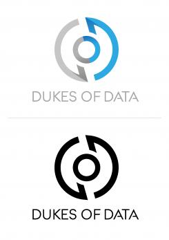
The black one is better, as it does not contain any color gradient in any way. The font is great and looks good.
It reminded us of a pokeball from pokemon, of a eternal circle and a nipple. What a range :)
I hope, this feedback helps you to step up (although I have no idea, where you are going next).
Cheers
joe
Keine Kommentare
Hi Sascha,
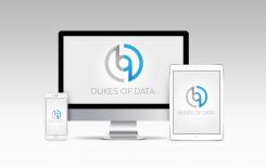
thanks for putting the logo into online versions.
This gives us some idea how it could look like.
Cheers
joe
Keine Kommentare
Hi Sascha,
have fun with your CS:GO games :)
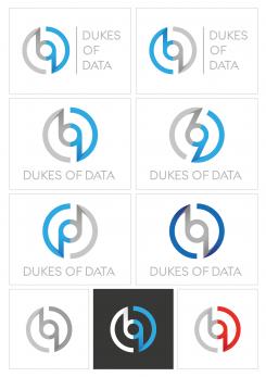
Here we have more versions of the original logo. Thanks for showing these here.
It's interessting that the change of the side, where the circle turns does not make that difference. In the middle it is much more clearer, from which direction the lines come from. so It's either a "p" oder a "q" I can see there. Unfortunately the D and the O get a bit lost in these variants.
Personally I love the fact you showed us differnt usage of the "Dukes of Data" letters - without/in one line below/in three lines at the side.
Keep it going,
cheers
joe
Hello to everyone at Dukes of Data,
I'm glad you came by to take a closer look on the Logo I've made for you.
My goal was to do something simple, but it still should have his own identity.
So I've created something that is simultaneously sharp and round.
It's versatile, and that's what I like about it. But what do you think?
At last, I want to say thank you. There are many Contests with Zero feedback.
So many people want to have a Logo, but don't want to go the extra mile and give us their opinions.
Your Team is different. And that is awesome.
But now it's time for few rounds CS:GO, your introduction made me want to play it again.
Best regards,
Sascha Sanz
aka Sarkel
Hi Sascha,
thanks for your kind words. We are certain, only feedback can give us something great from all of you. Maybe we are not consistently on one line/design but it's ok. We appreciate every work we see and our slack channel is growing extremly in our internal discussions.
Now to your design. Yes, it is shart and round at the same time, it is simple but not too simply. The main concern is the similarity to the beats logo. :)
The font is great with interesting twists in the As of the Data.
Thanks a lot,
cheers,
joe from Dukes of Data
 Nederland
 België
 France
 Deutschland
 United Kingdom
 International
