Keine Kommentare
Design a new logo & CI for “Dukes of Data GmbH
- Wettbewerb von: DoD´s
- Kategorie: Logo & Corporate design
- Status: Beendet
Startdatum: 30-07-2018
Enddatum: 15-08-2018
Alles begann mit einer Idee …
Ein kurzer, interaktiver Leitfaden half ihnen, ihren Designstil zu entdecken und erfasste genau, was sie brauchten.
Brandsupply ist eine Plattform, auf der kreative Fachleute und Unternehmen gemeinsam an einzigartigen Projekten und Designs arbeiten.
Kunden, die zum Beispiel ein neues Logo oder eine Markenidentität suchen, beschreiben ihre Anforderungen. Designer können anschließend über Brandsupply am Projekt teilnehmen, indem sie ein oder mehrere Designs einreichen. Am Ende wählt der Kunde das Design aus, das ihm am besten gefällt.
Die Kosten variieren je nach Projekttyp – von 169 € für einen Firmen- oder Projektnamen bis zu 539 € für eine vollständige Website. Der Kunde entscheidet selbst, wie viel er für das gesamte Projekt bezahlen möchte.
Hi Sariaka,
thanks a lot for showing us this usecases.
It is so great to see your logo at work and on real stuff.
We love it,
cheers
joe
Hi Joe
Thank you
Keine Kommentare
Hi Sariaka,
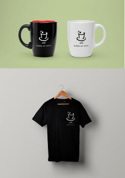
thank you for showing us the monocle-guy in action. Looks great and works nice.
We can image this pic on coffeecups and t-shirts too and it will look awesome.
Thanks
cheers
joe
Hi joe
Thank you for your feedback, I will show it on coffeecups and t-shirts.
Sariaka
Keine Kommentare
Hi Sariaka,
thanks for another good and new logo.
It's great to see an integration of the O into the shape of an element. The issue we consider is that we cannot seperate them anymore if we go this way.
Thanks a lot for another suggestion and your work,
cheers
joe
Keine Kommentare
Hi Sariaka,
well this is an absolut wow-ing one!
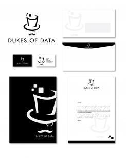
At the first glance it is... a coffee cup? A second later, no it's a hat. And then we noticed the monocle and the moustache.
So it is telling some stories: we can pull a rabbit off the hat; we are the sugar in your coffee; we are the distinguished old school gentlemen ... and so on.
So this one left us agaped.
It would be a bold choice in business context, but it definitly is something different.
Thanks for coming up with something unusual! We loved to discover this one.
Cheers
joe
Keine Kommentare
Hi Sariaka,
thanks for your new ideas.
Playing with these shapes does show us something new, although it remindes of electronic symbols.
But it is clean and clear.
No wow at this one... but you have submitted other stuff...
Thanks,
cheers
joe
Keine Kommentare
Hi Sariaka,
thanks for playing with the last entry.
It's nice to see a variation, although it is close to the original. But to judge it, we have to see it.
As the difference is not too big, I do like the first one better. Here the one with the dots in the upper corner does put this corner forward. We are not sure, if we like this :D
Thanks a lot for coming up with this variation,
cheers
joe
Keine Kommentare
Hi Sariaka,
this one is great! We can see the shield, it does have a square form and is clean executed.
We love this one. You have gone a long way and your developement is great to see.
Thank you for your work & for showing us your diversity.
Cheers
joe
Hi Joe.
Thank you for your feedback. I just have one question: You prefer color logo or black and white logo?
Cordialy
Sariaka
Keine Kommentare
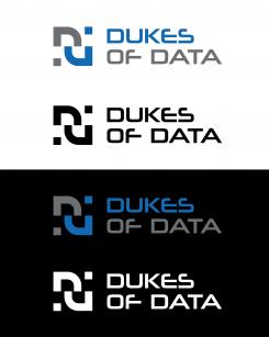
Hi Sariaka,
thanks for your improved design.
The font is an improvement. This one is better than the other one.
The symbol/element is playing with the Ds again. With the colors, it is better to see the letters in it, but the white one is hard to recognize.
Overall, thanks and keep it going.
Cheers
joe
Keine Kommentare
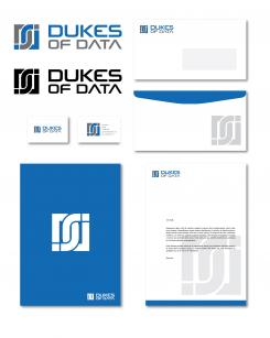
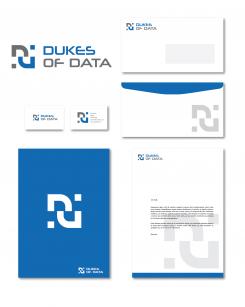
Hi Sariaka,
it's great to see how your design will look like on paper. This helps our imagination a lot.
Again, the symbol only looks a bit like "p" or "j" or "u" with an i-dot.
The envelope is stunning.
Thanks for your work so far,
joe
Hi,
Thank you, I will re-work on the logo.
Sariaka
Keine Kommentare
Hi Sariaka,
thanks for your entry.
The grafic element is quite interesting, as this is something complete new. Without the words, it would be hard to recognize the Ds, but they are there.
Your font is modern, but does not click so far.
Keep it going and thanks again. Great to see your ideas.
Cheers,
joe from Dukes of Data
 Nederland
 België
 France
 Deutschland
 United Kingdom
 International
