Keine Kommentare
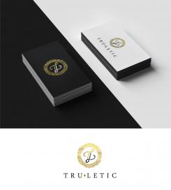
Truletic. Wort-(Bild)-Logo für Trainingsbekleidung & sportliche Streetwear. Stil: einzigartig, exklusiv, schlicht.
Startdatum: 03-09-2017
Enddatum: 10-09-2017
Alles begann mit einer Idee …
Ein kurzer, interaktiver Leitfaden half ihnen, ihren Designstil zu entdecken und erfasste genau, was sie brauchten.
Brandsupply ist eine Plattform, auf der kreative Fachleute und Unternehmen gemeinsam an einzigartigen Projekten und Designs arbeiten.
Kunden, die zum Beispiel ein neues Logo oder eine Markenidentität suchen, beschreiben ihre Anforderungen. Designer können anschließend über Brandsupply am Projekt teilnehmen, indem sie ein oder mehrere Designs einreichen. Am Ende wählt der Kunde das Design aus, das ihm am besten gefällt.
Die Kosten variieren je nach Projekttyp – von 169 € für einen Firmen- oder Projektnamen bis zu 539 € für eine vollständige Website. Der Kunde entscheidet selbst, wie viel er für das gesamte Projekt bezahlen möchte.
Hello, thank you for the 5 star rating :)
Keine Kommentare
Hello, I noticed you prefer free fonts than concept designs by designers. So here is my take on the design. this is handwritten.
Please rate 0 on my designs that you dont like so I can
delete them and submit more designs, cause I reached the 15 submissions already, and I want to send new designs. Please rate 0 stars on my other designs you do not like
Thank you artamad!
I disliked some older designs, and i´m looking forward to your new designs you want to submit!
Your last design with the handwritten free font, could be thicker. It`s appearing too filigree, so I think it would attract more women than man. Furthermore I search for something unique, this type of free font, seems to be ordinary. Thank you for your work!
Keine Kommentare
Any update or changes you want?
Keine Kommentare
Hello! I hope you like this combination of T and L at the same time can be used as a separate icon that looks amazing :)
Thank you for your effort and your new proposals! I basically really like the logo, especially the hexagon. But for the sports and streatware section, the initials are in my opinion too ornate. Could you please leave the thin endings of the letters out, so its going to appear straighter? Thank you very much
Do you mean like this?
Let me know if I got this right or you need changes, sorry for the confusion
Hello, any updates on this?
Hello, any updates on this?
Do you need anymore changes? :)
Keine Kommentare
How about these revisions?
Thank you for changing the logo so fast. However there must have been a misunderstanding concerning the diamond: I meant not between the Initials,it should be like a circle surrounding the initials but in the shape of a diamond. Thanks!
How about this?
Thank you for changing the logo. I liked the circle more, though. A diamond around the initials would be great just like the one between "tru" and "letic". You could also use ornamentation similar to the circle. Thanks for your effort!
Keine Kommentare
Do you need any changes?
Thank you! I really like this logo. However, I need more time to let the logo sink in. Maybe the circle is a little bit too feminin, could you change it in order to make it more unisex? Thank you
No problem, how about the colors? Do you like pure gold. or gold/black?
i prefer the gold/black version
 Nederland
 België
 France
 Deutschland
 United Kingdom
 International
