Keine Kommentare
Logo Design im Hollywood-Stil für eine aufstrebende Filmproduktion die sich auf hochwertige Hochzeitsfilme spezialisiert
Startdatum: 10-12-2012
Enddatum: 28-12-2012
Alles begann mit einer Idee …
Ein kurzer, interaktiver Leitfaden half ihnen, ihren Designstil zu entdecken und erfasste genau, was sie brauchten.
Brandsupply ist eine Plattform, auf der kreative Fachleute und Unternehmen gemeinsam an einzigartigen Projekten und Designs arbeiten.
Kunden, die zum Beispiel ein neues Logo oder eine Markenidentität suchen, beschreiben ihre Anforderungen. Designer können anschließend über Brandsupply am Projekt teilnehmen, indem sie ein oder mehrere Designs einreichen. Am Ende wählt der Kunde das Design aus, das ihm am besten gefällt.
Die Kosten variieren je nach Projekttyp – von 169 € für einen Firmen- oder Projektnamen bis zu 539 € für eine vollständige Website. Der Kunde entscheidet selbst, wie viel er für das gesamte Projekt bezahlen möchte.
I don't give up ;)
Thank you thats a nice idea with the pf but nevertheless it's not my favorite.
and this is other options...
Hi Lenny,
Here is my new proposal for your corporate identity.
It is completely different from the first one. I have chosen to make a more simple, more uncluttered logo. I played with the initials to make a 1 (Primest) and to show the quality of your work. I don't have an explanation for the colors, I just like it ;) it is modern, corporate and unusual in this type of activity.
I am waiting for your feedback.
Have a good day!
Thank you, it looks nice and the idea with the 1 is great, but it isn't what i want. Thanks a lot for your work!
Hi,
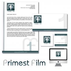
This is my proposal for your new logo. I am waiting for your feedback to give you a complete corporate identity (bus card, letter etc...)
I hope you will appreciate my work.
Sincerely
Stephen
I like the font, but i don't like the film stripe because almost everybody has something like that.
But thank you for your work. Maybe you could change something that it looks better to me.
I have seen your other works. Wow! It looks like you could do something much better than that. Please do not get me wrong, your design is not bad. In my opinion you always made the best designs for the other competition you attended in. That means, i like your style!
Thank you very much Lenny! I really appreciate. I will do y best to satisfy you.
I have some questions that will help me to create the right design.
Do you prefere a logo with a work on the initials P and F or an abstract shape?
In my first design I tried to do both, with the film strip that make us thinking of a bowtie and the initials inside.
But if you don't like it I will find another way.
Moreover what type of colors do you want?
Thank you
I have seen the bow tie but i dont like it, sorry ;-) But i would like it, if you find a way with the initials, so that it has a recognition value. Maybe you could play with another letter. Just do what you see in the name and do it your own way. I think i will like it, like the other works you did for someone else. Look at my favorite from gaetan, then you see that i like designs which looks professional, clear and with an idea in it. It has not to have a connection to film or something else. I don't have a favorite color but i dont like the brown. It depends on the logo.
Thank you and have a good day!
 Nederland
 België
 France
 Deutschland
 United Kingdom
 International
