Keine Kommentare
Startdatum: 02-02-2014
Enddatum: 16-02-2014
Alles begann mit einer Idee …
Ein kurzer, interaktiver Leitfaden half ihnen, ihren Designstil zu entdecken und erfasste genau, was sie brauchten.
Brandsupply ist eine Plattform, auf der kreative Fachleute und Unternehmen gemeinsam an einzigartigen Projekten und Designs arbeiten.
Kunden, die zum Beispiel ein neues Logo oder eine Markenidentität suchen, beschreiben ihre Anforderungen. Designer können anschließend über Brandsupply am Projekt teilnehmen, indem sie ein oder mehrere Designs einreichen. Am Ende wählt der Kunde das Design aus, das ihm am besten gefällt.
Die Kosten variieren je nach Projekttyp – von 169 € für einen Firmen- oder Projektnamen bis zu 539 € für eine vollständige Website. Der Kunde entscheidet selbst, wie viel er für das gesamte Projekt bezahlen möchte.
Hello,
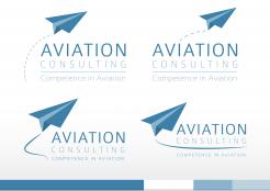
Thanks for the feedback on the first concept. I made some adjustments based upon your feedback. Some variations in which the logo has a slightly more dynamic touch. I showed options with a solid and a dashed line to symbolize the trails. O
f course, a lot of variations are possibly. Did i understand it correctly that the sentence "competence in Aviation" has to be part of the logo? Or are you planning to use it as a pay-off which doesn't have to part of the logo. I choose the first option, but here, but again.. a lot of variations are possible. I hope you like these new concepts. I stayed with the previous color scheme because i think it fits ideal to the line of business you will be involved in. That, combined with a strong message behind this logo('s) i think you can build a strong and unique identity.
All new feedback is welcome, don't hesitate to ask question as well!
Kind regards,
JM
Keine Kommentare
Yes you are completely right with the message ,I like the paperplane the shadowed Background of the first Picture and the small colored banner of the second one. Can you please integrate the words competence in Aviation. If you add also some lines behind ( like soft condensation trails) the aircraft showing movement would bring a bit more Dynamics .
Question : How would it look like if we move the plane to the left of the words ? Thank you rgds
Hello,
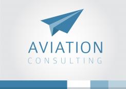
Hereby i present to you my first concepts for the logo for Aviation Consulting. To describe briefly what the idea behind this concept is: the paperplane symbolises the field of work you business is in, as well as the consulting business, but more also the airlines, airports organisations. I think this is a logo that would stand out because it's simplicity, it has a dynamic and positive feeling (reaching for the sky).
Also i presented the color scheme in which the visual identity could be build, based on the logo colors.
I would like to hear your feedback on this concepts.
Thanks in advance!
Kind regards,
JM
 Nederland
 België
 France
 Deutschland
 United Kingdom
 International
