 Nederland
 België
 France
 Deutschland
 United Kingdom
 International
Keine Kommentare
Flyergestaltung für
- Wettbewerb von: mokisgoodies
- Kategorie: Flyer, Eintrittskarte
- Status: Beendet
- Dateien: Datei 1, Datei 2
Startdatum: 29-07-2013
Enddatum: 29-08-2013
Total budget: € 249.00
Letzte Einreichung
Alles begann mit einer Idee …
Ein kurzer, interaktiver Leitfaden half ihnen, ihren Designstil zu entdecken und erfasste genau, was sie brauchten.
Brandsupply ist eine Plattform, auf der kreative Fachleute und Unternehmen gemeinsam an einzigartigen Projekten und Designs arbeiten.
Kunden, die zum Beispiel ein neues Logo oder eine Markenidentität suchen, beschreiben ihre Anforderungen. Designer können anschließend über Brandsupply am Projekt teilnehmen, indem sie ein oder mehrere Designs einreichen. Am Ende wählt der Kunde das Design aus, das ihm am besten gefällt.
Die Kosten variieren je nach Projekttyp – von 169 € für einen Firmen- oder Projektnamen bis zu 539 € für eine vollständige Website. Der Kunde entscheidet selbst, wie viel er für das gesamte Projekt bezahlen möchte.
Designer:
 Maarti Pictures
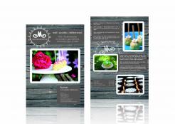
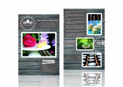
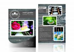
Hi Monika, I've tried to make changes as you've suggested, further changes are not a problem.
Best regards,
Martina @Maarti Pictures
Dieser Wettbewerb ist beendet. Es ist nicht mehr möglich zu kommentieren.
Keine Kommentare
thanks a lot. the front looks better now :-)
in the text box with the address: i imagine it could bring some tranquility in the front, if the title "Kontakt" is without the white frame, but in the same size and style as the header on top "mokis.goodies | delikat.essen".
the second white framed header could be deleted then.
On the back: could you divide the text box in two parts? maybe one on the bottom on the right?
thanks & best regards,
monika
Dieser Wettbewerb ist beendet. Es ist nicht mehr möglich zu kommentieren.
Keine Kommentare
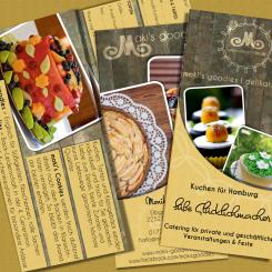
Hi, thanks for the design. Is it supposed to be in A5 Size?
In the description I attached 2 files with the text that is needed in the flyer.
Could you add it & show how the flyer would look like inside?
I like the design. On the first page I think that the "curve"thing on the bottom is too much. Maybe the "wood" looks better without this cover or it should be a bit more transparent?
Thank you very much & best regards,
Monika
Hi Monika, I will try to make these changes (use your text and adjust or remove the curve). Indeed I've meant the format to be A5.
Best regards,
Martina @Maarti Pictures
Dieser Wettbewerb ist beendet. Es ist nicht mehr möglich zu kommentieren.